 Here was when i was 50% through it
 Almost done....
 Final Product in wallpaper size for non wide screen if you interested.
Anyways, i also promised to post my rationale for it. I'll just copy paste it from my deviantart account.
---------------------------------------
Look in the mirror...
...and you will see your other self. Evil lies naked within all of us, we just have to pay attention to it. Many a times we are quick to point out the flaws of others, but remain ignorant of our own actions. More often than not we choose to neglect reflecting upon ourselves.
So is evil really that far off?
If we do not keep it in check it will eventually taint and consume us whole. Thus it is a constant battle of good vs evil.
................................................................
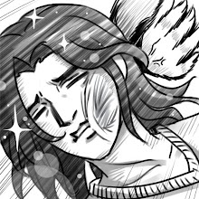
I'm bad at expressing things figuratively, so i went for the straight ball.
- Angelic and demonic side, well you get the drift. Straight forward enough.
- Almost naked demonic side, represents that evil lies naked within ourselves.
- Closed eyes for the angel side to represent ignorance.
- Tendril like things swirling around the connected palms represents the taint creeping in.
cliche....but i hope i get my message across clear enough ^^ ;;
---------------------------------------
Well, i don't expect anything from the competition. I wasn't really joining it with the motive to win anything (although winning is a bonus, which i doubt of course). More importantly i wanted to try doing something based on a contest theme. I just gave it my best shot so that i won't regret later for not participating at all. Thanx a lot to Jun who was always encouraging me to take part. I truly hope he comes up with something better than mine and get a win :D
I always tried ways to cg like what i have done for this pic. I think i am fairly satisfied with the results this time. I tried to use greater contrast by using more black. I know, in college the lecturers do not encourage the use of this color because it is a color-killer. But ImagineFX has taught me otherwise. Mastering the use of black brings out a greater sense of depth and contrast to your works, making it very stable and solid if controlled properly (and epic-ness in my own opinion). I wanted to challenge myself to be able to achieve that.
I guess that itself was already a victory for me. I am quite proud of what i have achieved for myself here. It took me longer than usual to finish this piece but it brought back the nostalgic feeling i had when i took onto a personal project seriously. I was already wondering if i could still have the determination to go through that again. I have proven to be still passionate about it.
Although not many will like it for its stereotypical-branding i am still very, very happy with the outcome of this pic. I tried thinking out of the box and doing something different for this theme. I came out with many ideas much better than this, but then in the end i asked myself, "What is it that i enjoy doing the most?" So i decided to go with this pic. I have always tried to avoid drawing angelic and demonic representations because it is too overused. But i cannot deny that i still enjoy it no matter how recycled these sort of depictions are.
I shall continue to refrain myself further or what you will be seeing from me will all be of the angelic-demonic sort.
---------------------------------------
Oh i also wanted to share some things i learnt from ImagineFX. For those majoring in IL and is greatly interested in digital painting or CG, i recommend getting this book. I know it is not cheap, but it is worth every dollar you pay because they even include a resource CD which has brushes for photoshop to works from featured artists of that particular issue. If you really cant afford it then get a glimpse of it in the TOA library.
There's a very good tip i used in this work by one of the artists featured in IFX. He works in grayscale first to get the sense of '3d'-ness right before he adds in color tones. So from there i picked up turning my colored works into grayscale. While you are working on it, save up often and constantly convert it into grayscale to check. It truly makes your colored works less flat and brings it another level.
And a personal advice from me before truly ending this post. Save often and make LOTS of backup copies whenever you can. It really stinks to have to redo a work because you saved in a single file and it gets corrupted (e.g. power blackout while saving). I have not experienced it myself before because on day 1 i picked up CG, i made countless copies all over every single available space and hard disk i have. I fear losing my precious works so much that i even burn mutliple copies of them into DVDs. Please, please heed this simple but very very useful advice.


No comments:
Post a Comment